SK Enmove: Visualizing Invisible Efficiency
Redefining a Lubricant Leader as a Global Clean-Tech Visionary

Overview
A global brand film produced to signal a strategic transition for SK Enmove, a leading lubricants provider, into the clean-tech sector. The client came with a clear business ambition: to be seen as a future-oriented clean-tech company, not just a lubricant manufacturer. What they didn't yet have was a visual language to make that ambition legible. My role was to build that language from the ground up, defining the narrative framework, the visual system, and the aesthetic identity that would carry the brand into a new category in front of global investors and stakeholders.
Strategic Context
Legacy Perception Trap
SK Enmove's core business, lubricants and base oils, carries a strong industrial identity that works against the clean-tech positioning the brand was pursuing. For global investors evaluating the company's future trajectory, the gap between where the brand had been and where it was headed needed to be bridged credibly, not just asserted.
Invisible Technology
The technologies at the center of SK Enmove's clean-tech transition, immersion cooling fluids for data centers, EV lubricants, and base oil upcycling, are invisible by nature. They operate inside machinery, inside servers, inside systems that audiences never see. Making these technologies feel real, significant, and visually compelling was the central creative challenge of the project.
A Fragmented Portfolio
EV lubricants, immersion cooling, and upcycling are distinct business areas with different markets and different audiences. Without a connective framework, the brand risked presenting a collection of separate initiatives rather than a coherent strategic vision. The brief needed to become a single story.
Aesthetic Limitations
Industrial lubricant marketing has its own visual conventions: heavy machinery, dark tones, gritty textures. These conventions were actively working against the premium, future-oriented identity SK Enmove needed to project. The visual language itself had to change.
Core Decision
The starting point for this project was an observation that turned into the creative foundation of everything that followed.
Correcting a Visual Misrepresentation
Base oil, the core product at the heart of SK Enmove's entire portfolio, is naturally translucent, almost water-clear. But years of marketing convention had represented it as yellow or amber, borrowing the visual language of engine oil rather than reflecting the actual material. I proposed building the entire campaign around the product's true visual identity: a translucent drop that travels through the brand's ecosystem, connecting every business sector in a single continuous journey. This wasn't just an aesthetic choice; it was a correction that gave the brand a more honest and more distinctive visual foundation than anything competitors were using.
A Single Narrative Thread Across a Fragmented Portfolio
Rather than presenting EV lubricants, immersion cooling, and upcycling as separate initiatives, I proposed a unified narrative framework in which the base oil drop serves as the connective tissue, moving from engine interiors to data center cooling systems to regeneration facilities, making the full scope of the brand's clean-tech ambition visible as one coherent ecosystem rather than three separate stories.
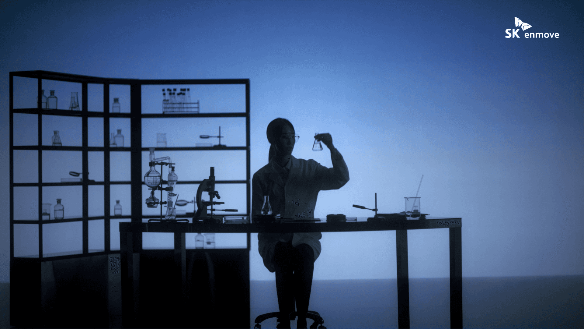
Clean-Tech Clarity as the New Aesthetic Standard
I defined the visual direction as a departure from industrial convention, replacing heavy textures and dark tones with a minimalist, blue-toned palette that positioned SK Enmove alongside global clean-tech leaders rather than within the traditional energy sector. This aesthetic shift was proposed as a long-term visual standard, not just a campaign execution.
Visual & Narrative System
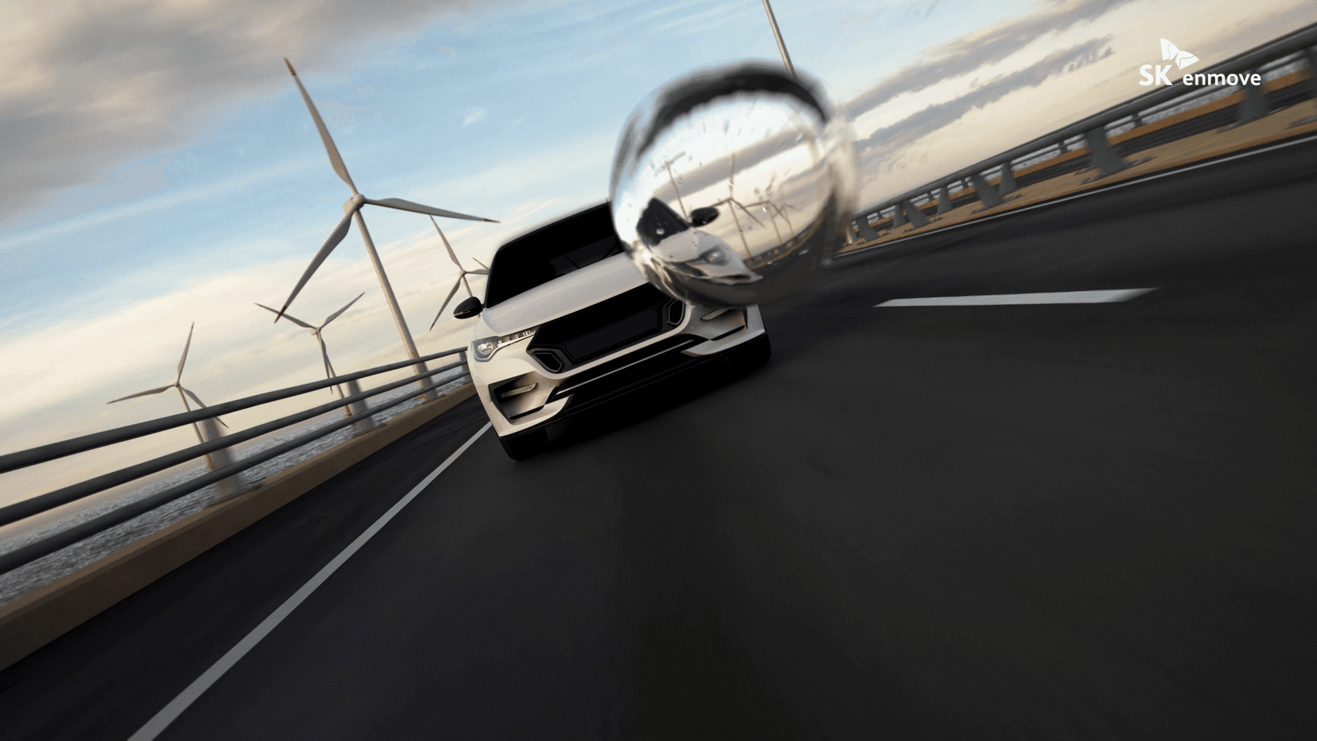
Translucent Base Oil Drop as Narrative Engine
The hero film follows a single drop of translucent base oil as it moves through SK Enmove's universe, beginning in engine interiors, traveling through EV systems, and flowing into data center immersion cooling environments. The drop functions as both a literal product and a symbolic thread, making visible the invisible connections between the brand's diverse technologies.
Micro-to-Macro Visual Rhythm
The film was structured around a repeated visual movement, diving into microscopic interiors and expanding outward to global infrastructure, to dramatize the relationship between the precision of the material and the scale of its application. This rhythm gave the film a sense of continuous discovery, drawing the viewer deeper into the brand's world with each cycle.
Establishment of Visual Standards
The color language, lighting approach, and compositional logic established in this film were designed to function as a replicable visual standard across all of SK Enmove's future clean-tech communications, not a one-off creative direction, but a foundation the brand could build from consistently.


Impact
Adopted as the Definitive Brand Asset for Global IR
The film and its derived assets, eight tailored versions adapted for different global touchpoints, became the primary identity material used at high-stakes investor relations summits, establishing a consistent premium expression for the brand in front of the global stakeholder audiences that matter most to its clean-tech transition.
Visual Identity Established for a New Category
By grounding the campaign in the product's true material properties and building a visual language that had no precedent in the lubricants industry, the project gave SK Enmove a distinctive and credible position within the clean-tech sector, one that could be sustained and developed across future communications rather than reasserted from scratch each time.
see also


