IZ*ONE: Architecting an IP Universe
Translating Sonic Energy into a Symbolic Immersive Visual World
Overview
This was production design and set art direction for IZ*ONE's comeback music video, teasers, and concept photography, built around the album concept Oneiric Diary, a group moving through a dream turned into reality. The director and label brought the narrative concept. My job was to take that concept and build it into physical space, designing the sets, proposing the visual devices and symbolic objects, directing color and lighting, and coordinating with the CG team so the physical and digital worlds read as one place.
The Challenge
A set that doubles as IP
In K-pop, environments aren't just backdrops, fans study every frame for weeks after release. Whatever I built needed to hold up under that level of attention, function as a real cinematic space and a symbolic system at once.
Spaces that don't follow physical logic
The concept called for staircases above clouds, giant clockwork mechanisms, columns suspended in air. Making all of that feel internally consistent instead of arbitrary was the real design problem.
Two moods in one film
The track carried both elegance and fragility, and the world needed to move from something pure and weightless toward something saturated and spectacular by the end. That arc had to live in the physical sets before filming even started.
Key Insight
A concept isn't a set. It's only a direction
A room built around clocks says nothing about which clocks, at what scale, in what material, or how performers move through them. Every symbolic idea in the brief needed a spatial language before it could become something audiences could actually experience.
Big Idea
One world, not a collection of sets
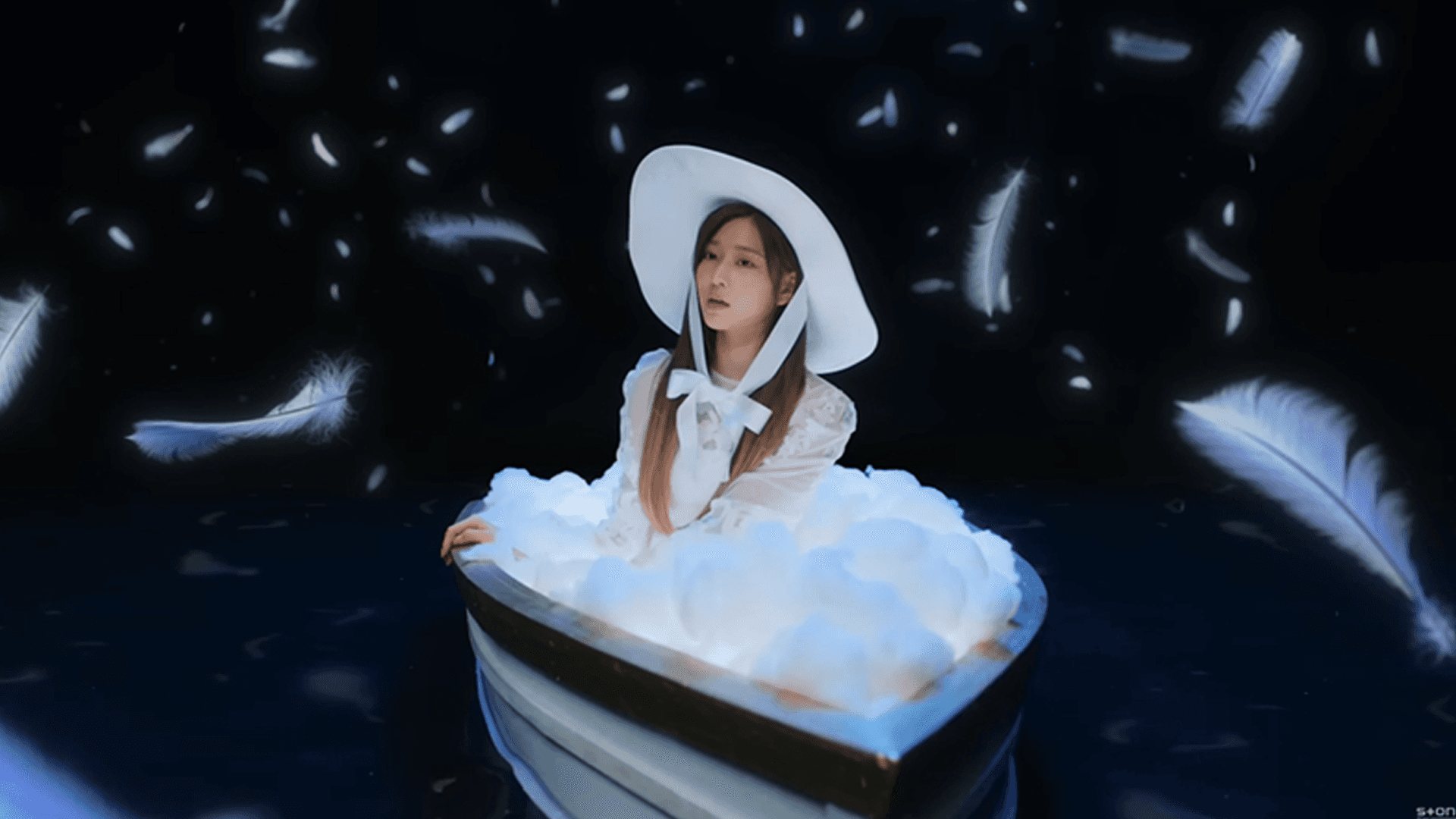
Rather than designing individual stages, I approached the project as one coherent world with its own internal logic. Feathers replacing the flowers from the group's previous visual era, oversized clock mechanisms, crystal elements, and architectural forms all became part of one visual vocabulary rather than isolated design choices.
The space carried the emotional arc
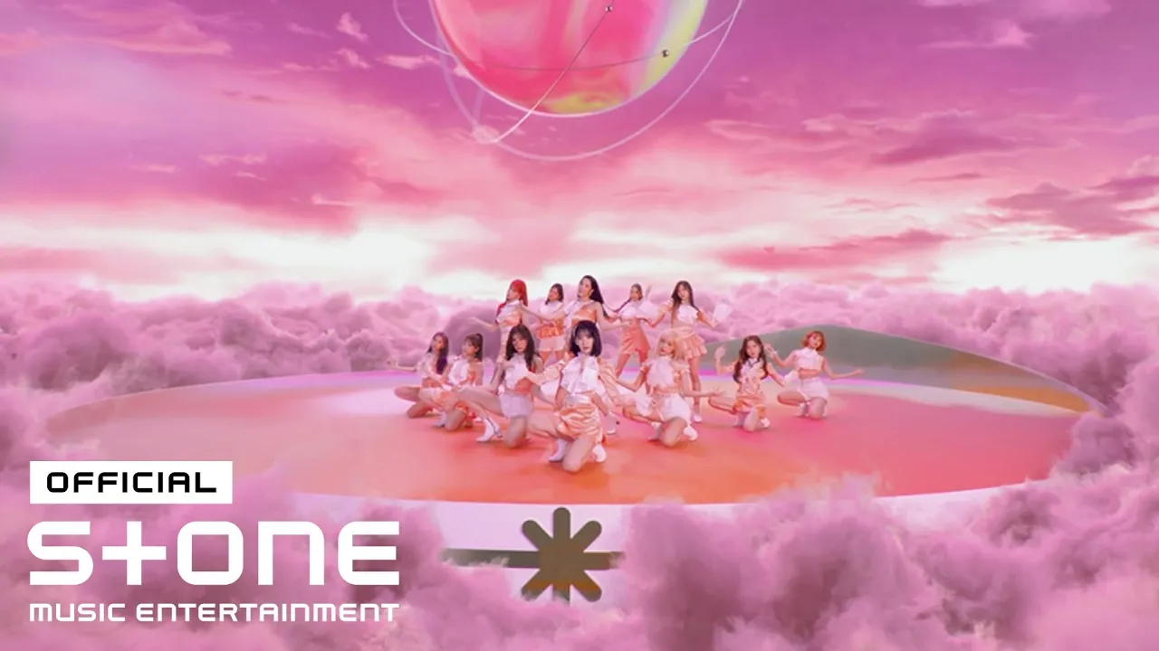
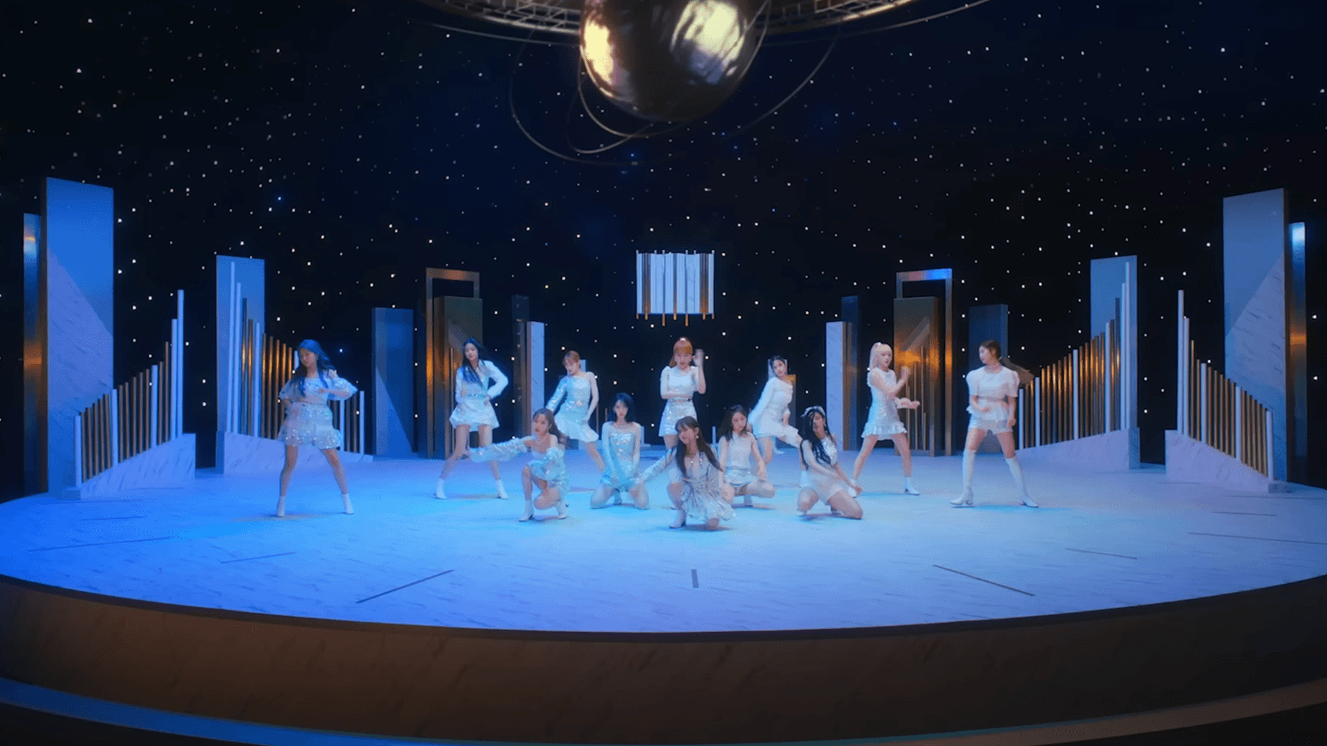
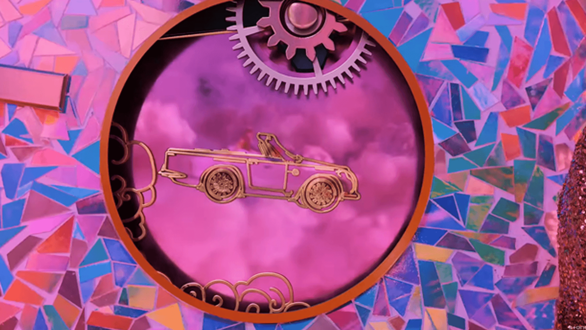
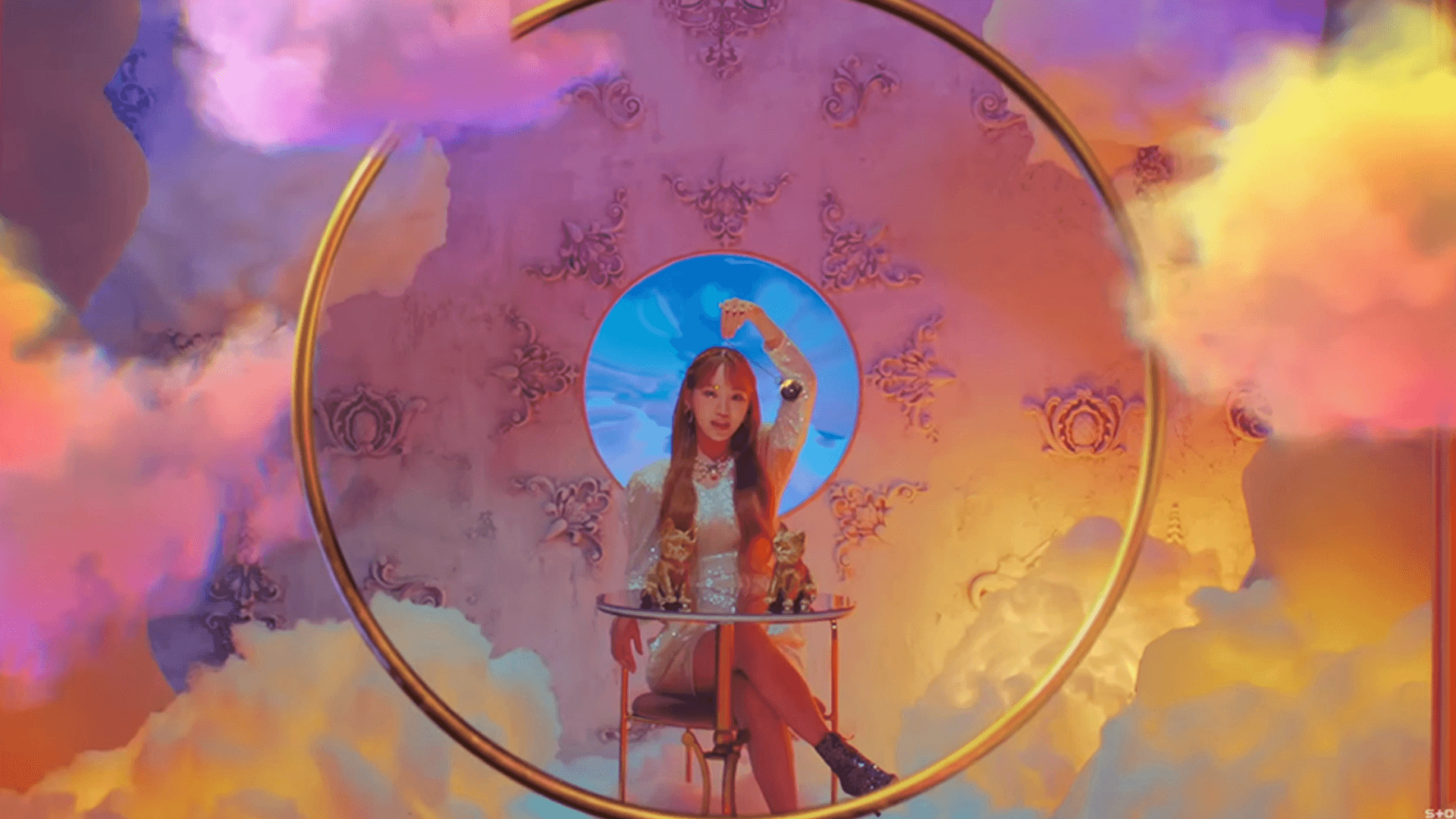
The emotional progression of the song was designed directly into the environments themselves. White, silver, and pearl established a dreamlike beginning inspired by the swan motif, gradually shifting toward holographic light and saturated pink, purple, and mint as the story reached its climax. The transformation happened inside the physical space rather than being left to post-production.
Bringing It to Life
Symbolic ideas became physical architecture
The clockwork environment transformed the abstract idea of time into a space performers could actually inhabit. Oversized gears, moving hands, and classical mechanical proportions gave the set an internal logic that made even impossible architecture feel believable.
The environments responded to performance
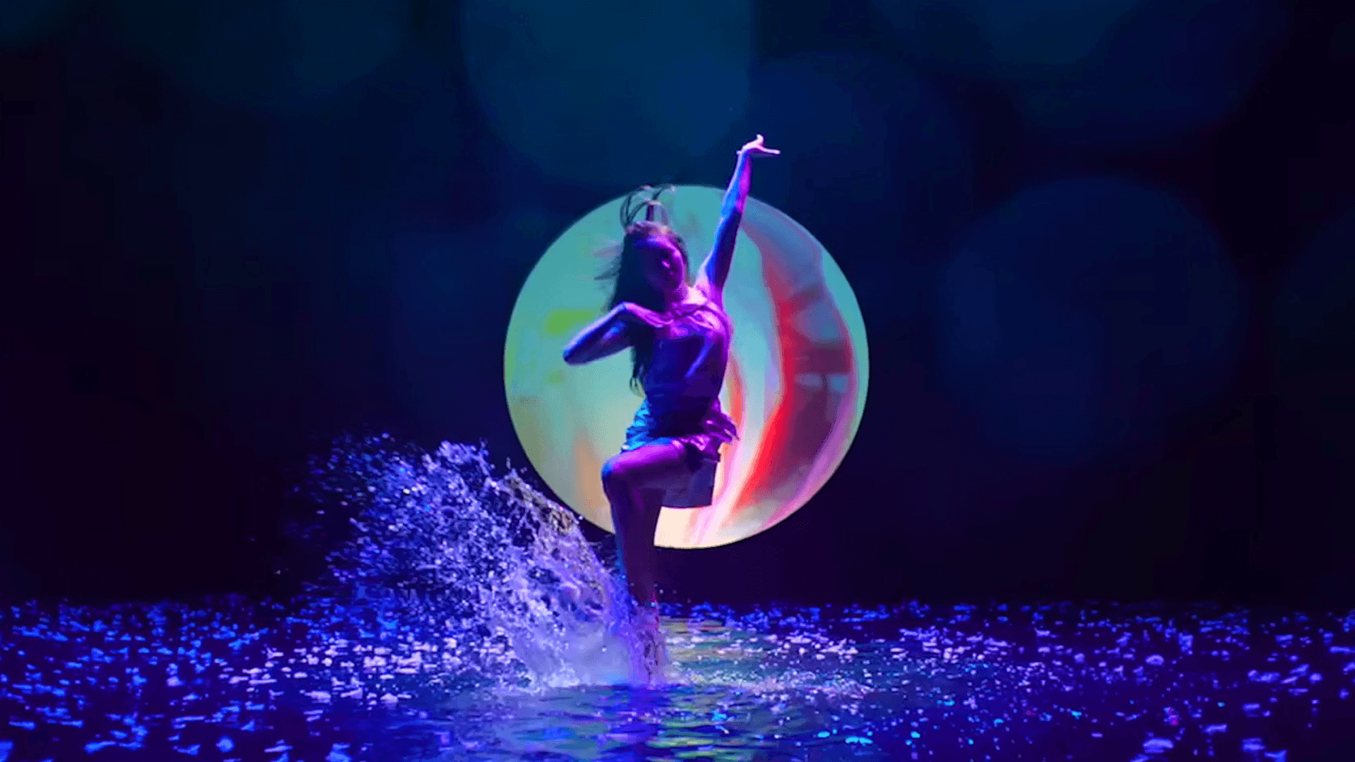
The water stage was designed to react in real time to movement, allowing ripples and reflections to become part of the choreography rather than decoration. The same principle guided collaboration with the CG team, establishing clear boundaries between physical construction and digital extension so every visual effect remained grounded in a believable world.
Result
Cultural Impact
The music video surpassed 117M views on YouTube, while its layered symbolism and recurring visual motifs kept fan interpretation and discussion active long after release.
Visual Legacy
The production design established the defining visual identity for the Oneiric Diary era, becoming the reference point across the group's music video, teasers, and promotional imagery.

see also